Lesson 2: Wireframing and Design (Why Customize? - Part 2)

So How Do I Design This Thing?
When you start thinking about your design, you’ll wanna keep 3 things in mind.
The importance of UX
The first and most important thing is the overall user experience. How will users interact with your knowledge base? How will they find the answers they’re looking for? What will be the quickest and most engaging way for them to succeed?
For us, and I imagine the vast majority, that means focusing on search-based navigation. Though this might not be the case for you.
What's Supported
The second thing you'll want to consider are the limits of your chosen software. At this early stage, knowing what is and isn't feasible and what you can and can't change will save you a bunch of time and frustration later on.
Know Your Limits
And by limits I mean knowing what you and your team can realistically achieve. There’s no point in you or your design team designing in a bunch of functions that you’re not sure exist natively or that you can’t build yourself.
Wireframing
Before we move into making things look pretty, we need to take our considerations above and turn them into a wireframe. The wireframe is a basic outline of where elements of the knowledge base should go. For the purposes of this course, I'll be using a hypothetical brand called The GoodLife.
The Homepage
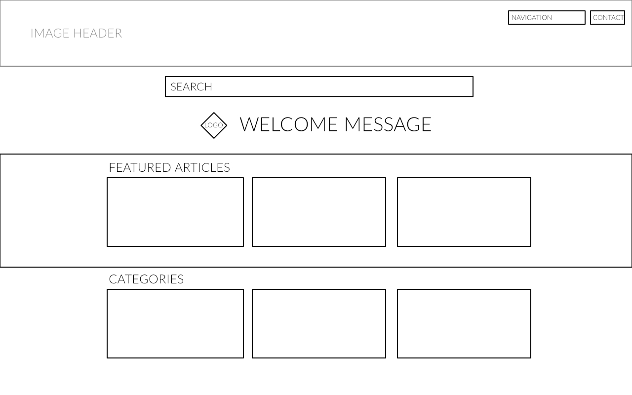
As you’ll see, our wireframe places a search bar as one of the first things the user will encounter. It’s also intended to be a sticky search so it'll be at the top of the page no matter how far down the user scrolls.
After that, we’ve got space for featured articles. These are articles picked by the administrators to highlight a specific thing. Maybe it's a product update, a recall notice, or just some random article you want all your customers to engage with.
And below that is the traditional navigation flow, which lists all the available categories of articles.
Category Page
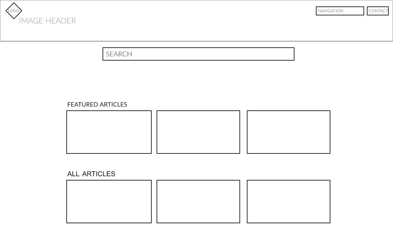
You'll no doubt have noticed the main difference between the homepage and category page is that the featured articles are no longer confined to a separate section.
Article Page
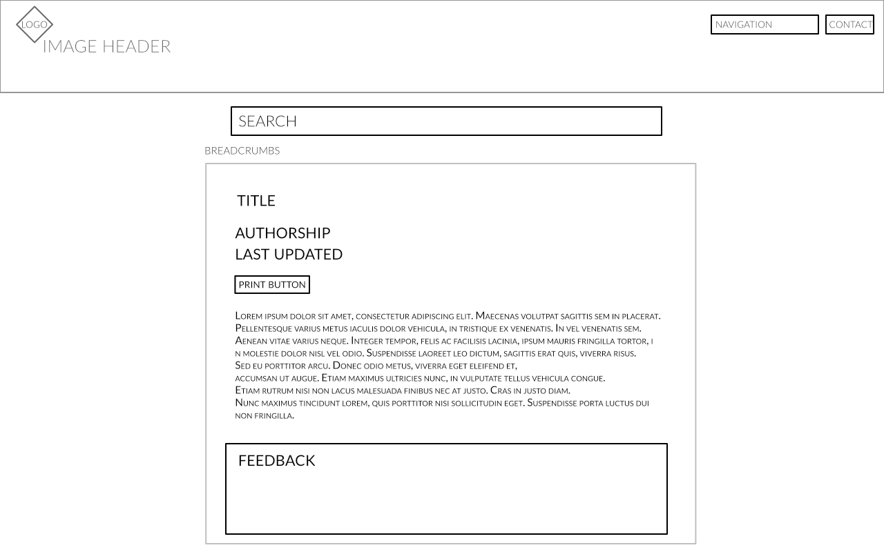
In the article wireframe, we have a section for the main body of content alongside some meta information, a print button, and a space for feedback.
The Design
Now we’ve got our wireframes, let’s take a look at the final design and how we can implement it in the most efficient way, without sacrificing usability and the brand experience.
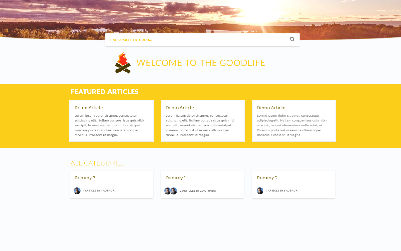
Knowing my limits, I've based this knowledge base on the Curve template. This means we can download the Curve starter template and save a whole bunch of time 👍
For The GoodLife the first thing customers should see is a bright, vibrant yet peaceful visual. The header is clearly branded, and it all fits the style and brand experience we want to create.
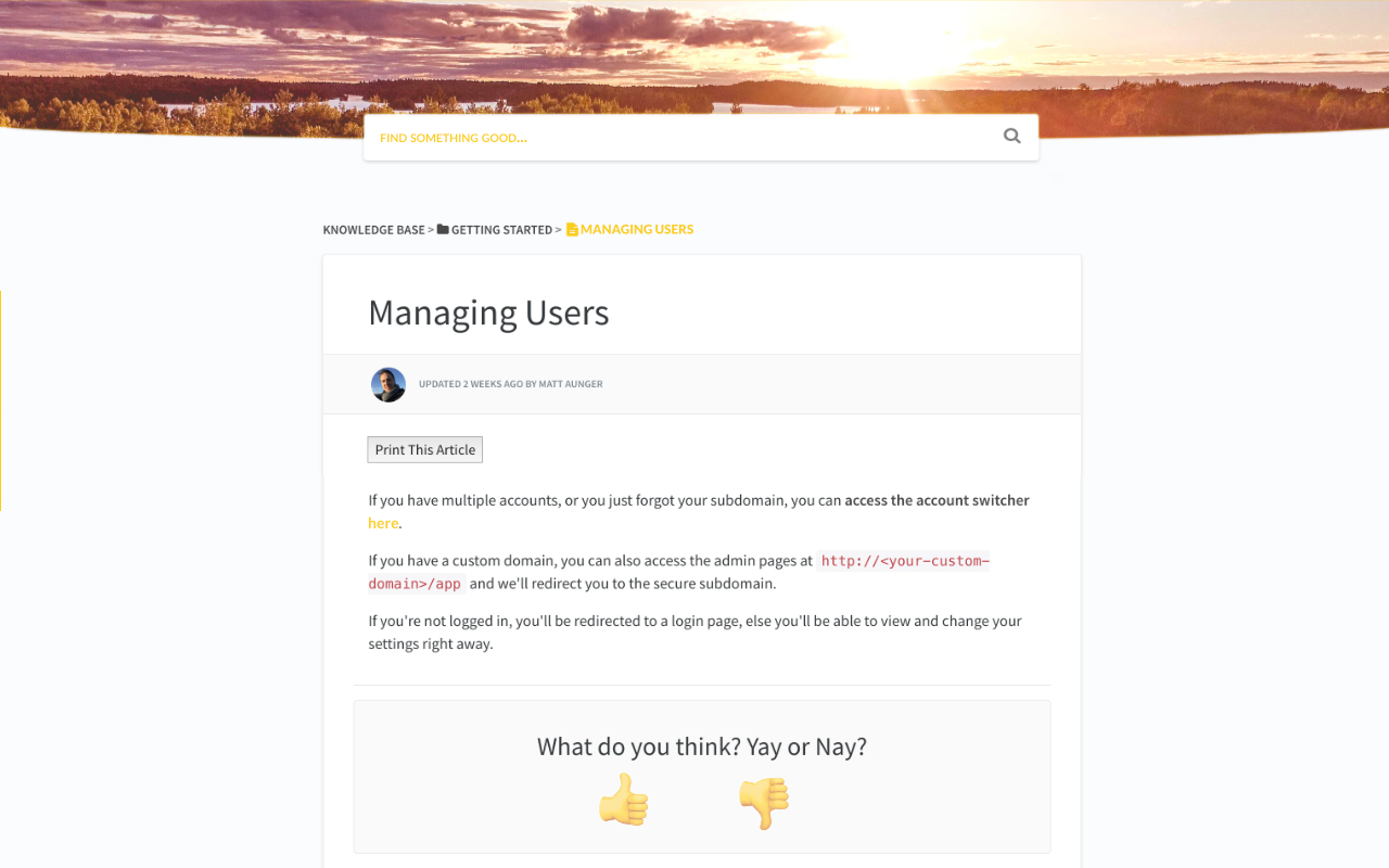
The article layout you might notice is much the same as the standard Curve layout with the exception of the visuals, colours, and some light tweaks to the design such as adding rounded profile images for authorship.
What isn’t visible in the visual design is the sticky element from the wireframe, but we’ll just keep that in mind as we head to the next stages of actually customizing.